Overview
ReopenCU is an individual research and design project conducted by me. I addressed the challenges of redefining the school covid app user experience for Columbia University affiliates who are coming onto the campus for any purpose need to complete a daily symptom questionnaire available through the app.
Based on solid research findings, I redesigned the existed functionalities and added new features to respond to users’ needs.
My Role: UX Research, UX Designer
Team: Charlotte Hou
Location: New York
Duration: 2.5 months
Analysis
Heuristic Evaluation


Research
Background and Goals
This School Covid mobile app redesigning project needs evidence from research to find users’ pain points as well as their expected functionalities which are not included in the current app.
Generative Research Goals
- Understand our target personas’ task flow when browsing and using ReopenCU app on a daily basis.
- Understand the layers of validation & feedback our persona needs in order to know their expectations for the new version app.
Design Goals
- Find easier navigation to get useful information.
- Create an intuitive display of the most important notification, for example, a Covid-testing result is missing.
- Present the information most likely to be used in a direct way to help users to save time searching around.
- One place for all relative information.
- Social function to share helpful covid information and to increase interactivity.
Methods
Conduct contextual inquiries
During the inquiries, I formed empathy with interviewees by observing them using the app (including uploading documents, reporting daily symptoms, and searching information to get help), sensing their emotions, and asking questions about their pain points and expectations, through which I also took bilingual notes about important findings and flashed design ideas.
I also conducted surveys and took notes from the reviews of the app from Apple Store.

Users Persona
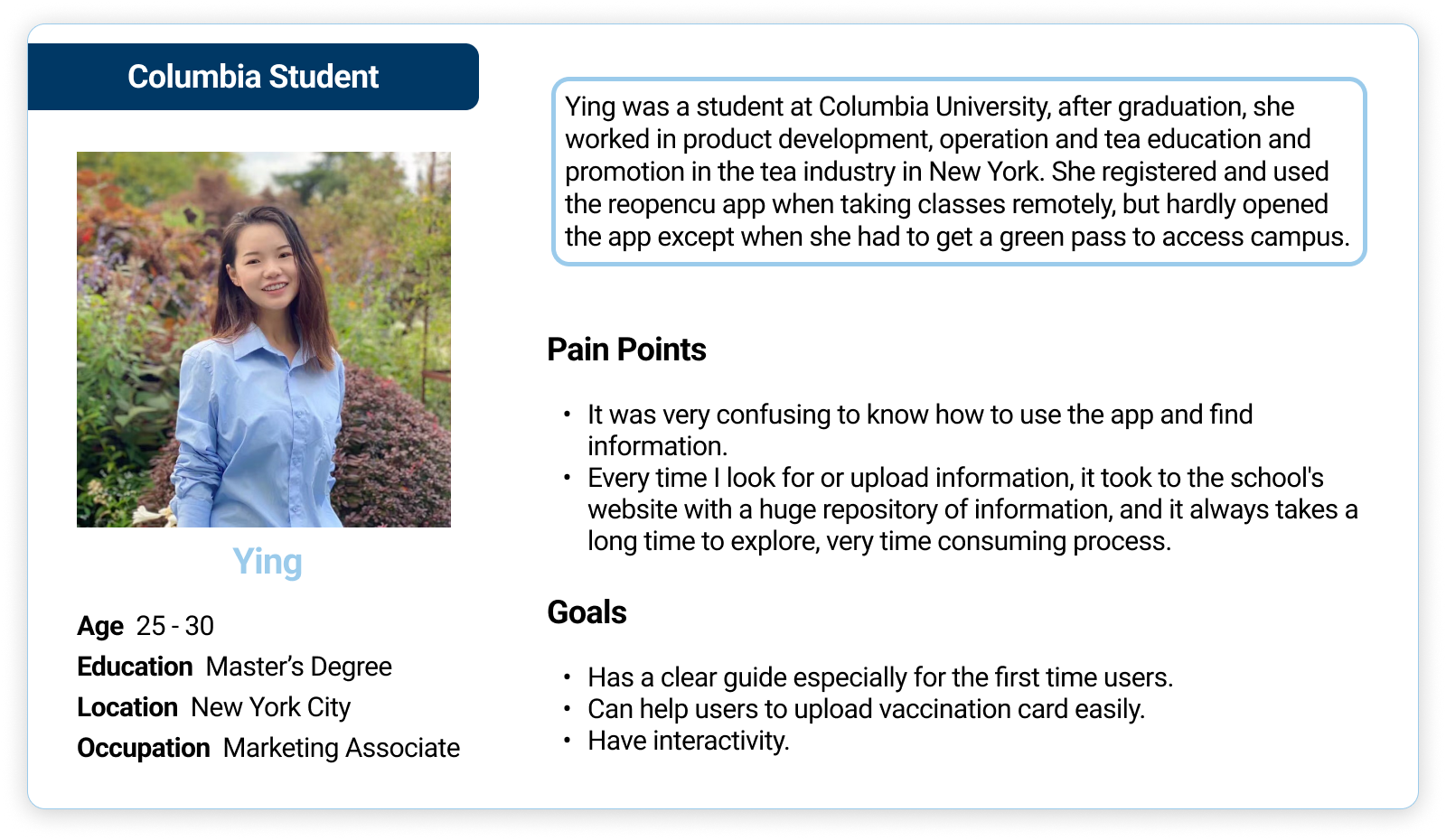
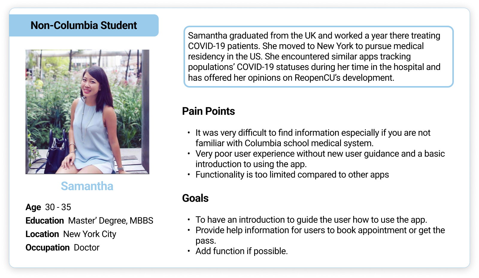
To find problems from different perspectives, I did 1 to 1 interviews with 4 Columbia students and 2 non-Columbia students. Both groups expressed a desire for a more efficient way to get useful information to complete the process of getting through and getting more coronavirus-related news, as well as a desire for more interactivity. 👩🏻💻
The interview included the user's pain points and goals, and I chose two interviewees with the most representative viewpoints to show as the personas.
Survey
In order to get a more complete understanding of the students' feedback, I did a survey and obtained more accurate survey results based on the data.

The respondents consisted of 80% students and 20% school faculties
Competitive Analysis
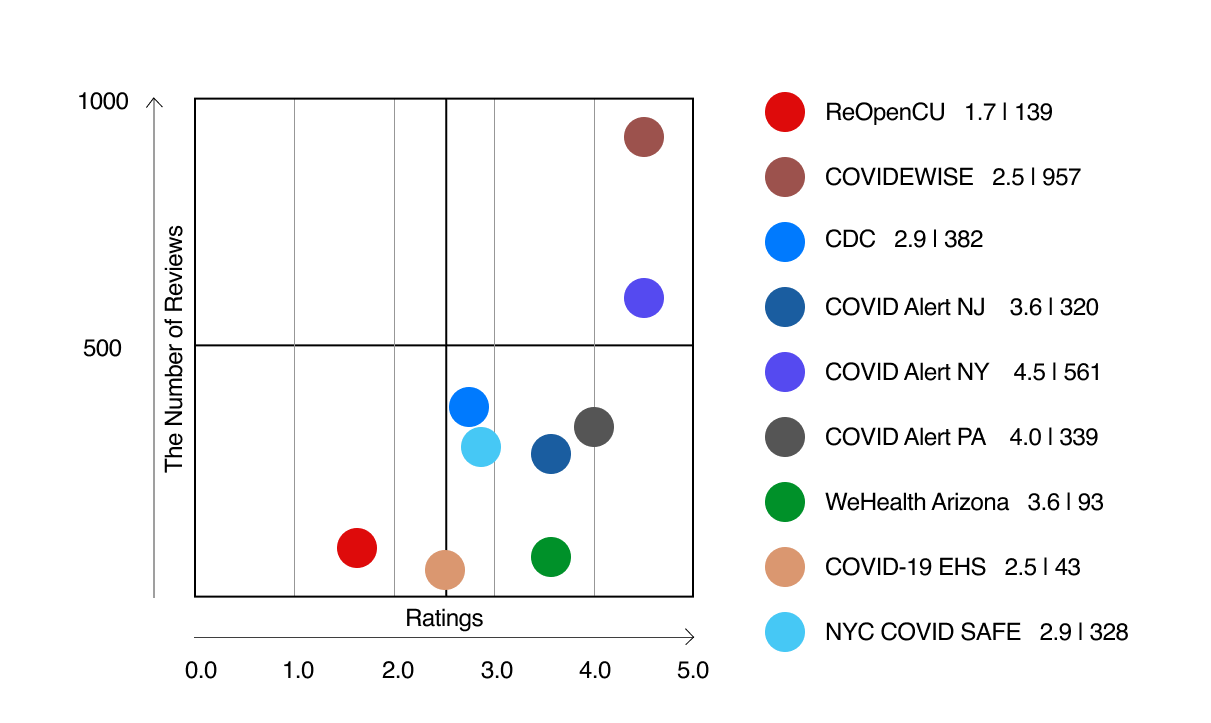
I selected some covid apps commonly used by citizens and arranged the data into the following figure, and then analyzed their popular functions and the reasons for high or low evaluations in turn according to the distribution map.
When selecting the comparison apps, the extremely high and extremely low examples were removed, so that the data had a better reference value to ReopenCU.

Ideate
User Flow
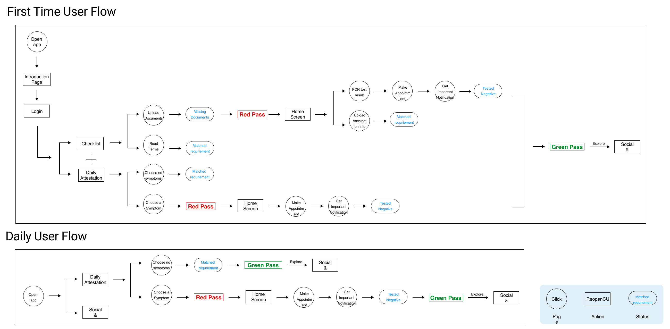
To further define users’ actions, I created user flows to gain a better understanding of how users will use it, and the introduction page will guide users to know how the app work before they start the app. 👣
Information Architecture
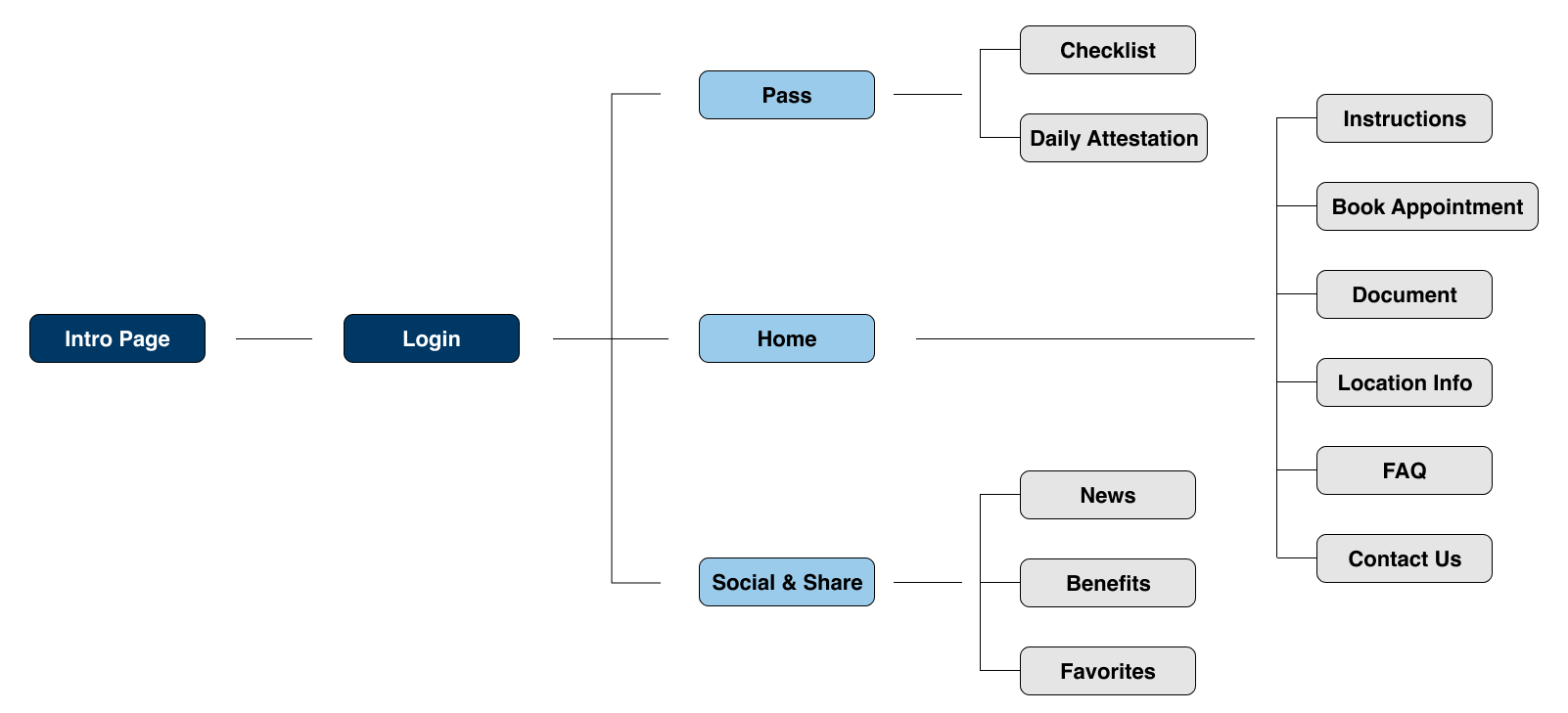
Based on the evaluation of previous mobile app, I defined 3 main features: pass page to get access to the campus, home page to get helpful information and social & share page to share news and benefits as well as networking. 📄
Design
Sketches
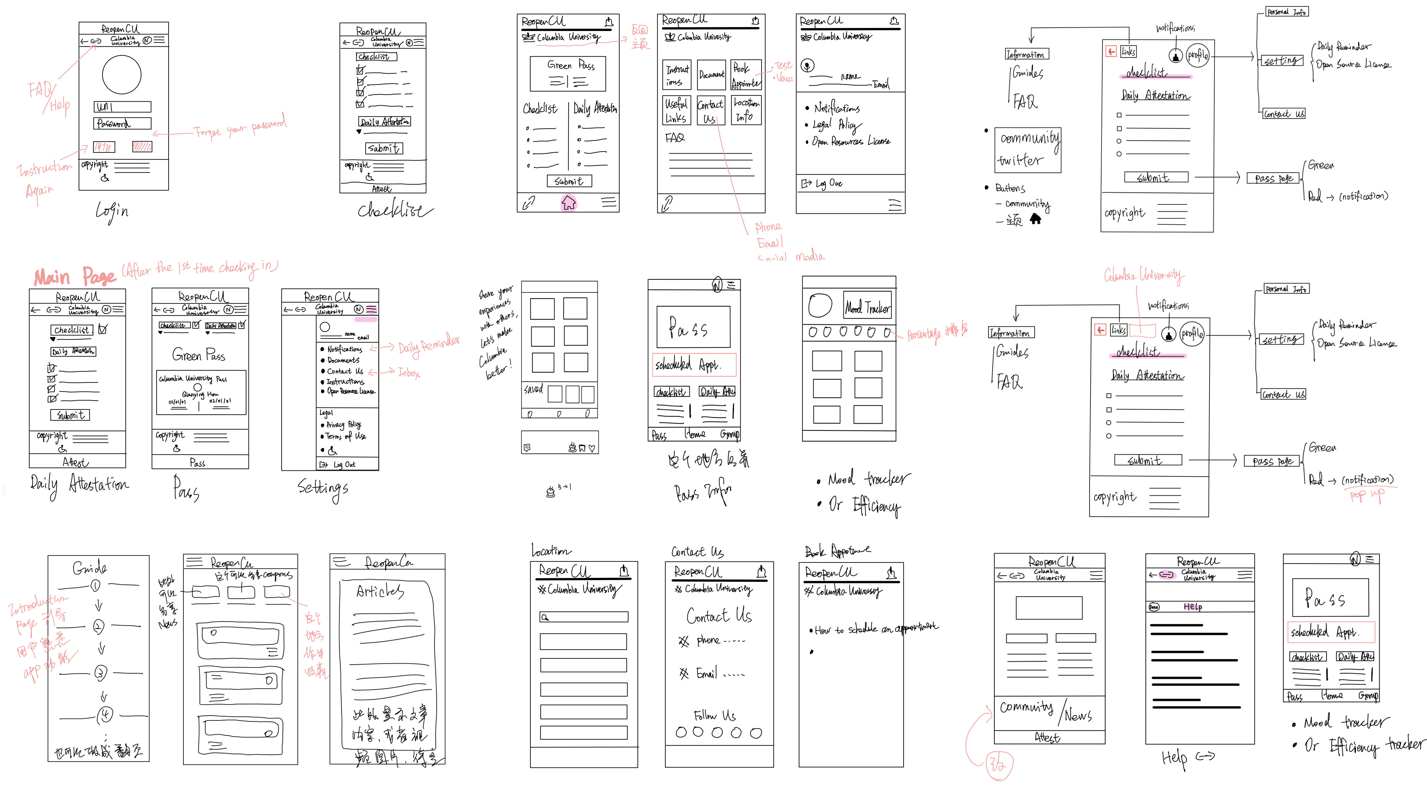
To put down the ideas to real designs, I started with doodling on my iPad 😬
Wireframe & Drafts
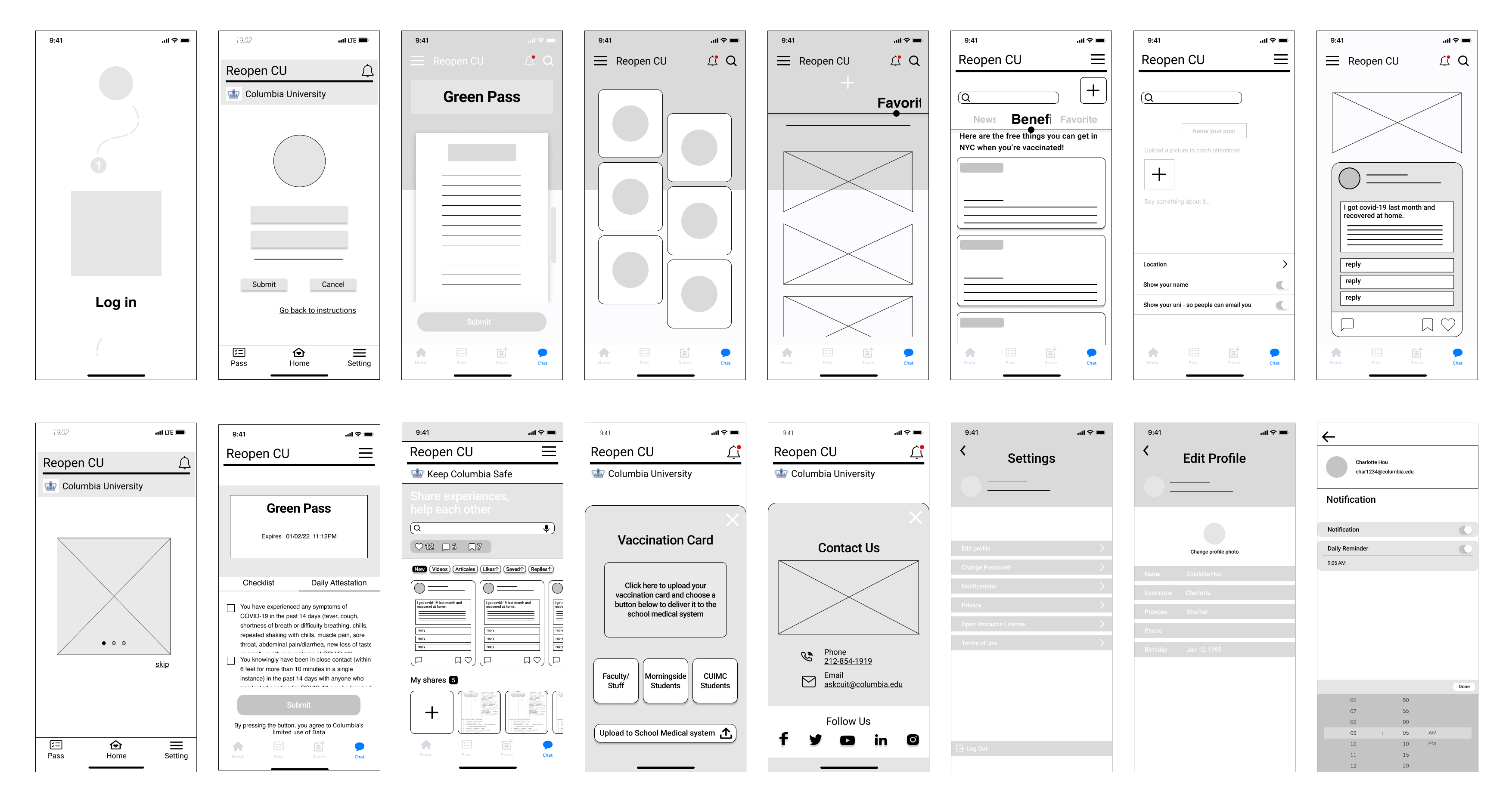
I created most of pages based on the information architecture with a few different versions and discuss with potential users to pick the most suitable one for the next stage. 💻
Color Palette for ReopenCU
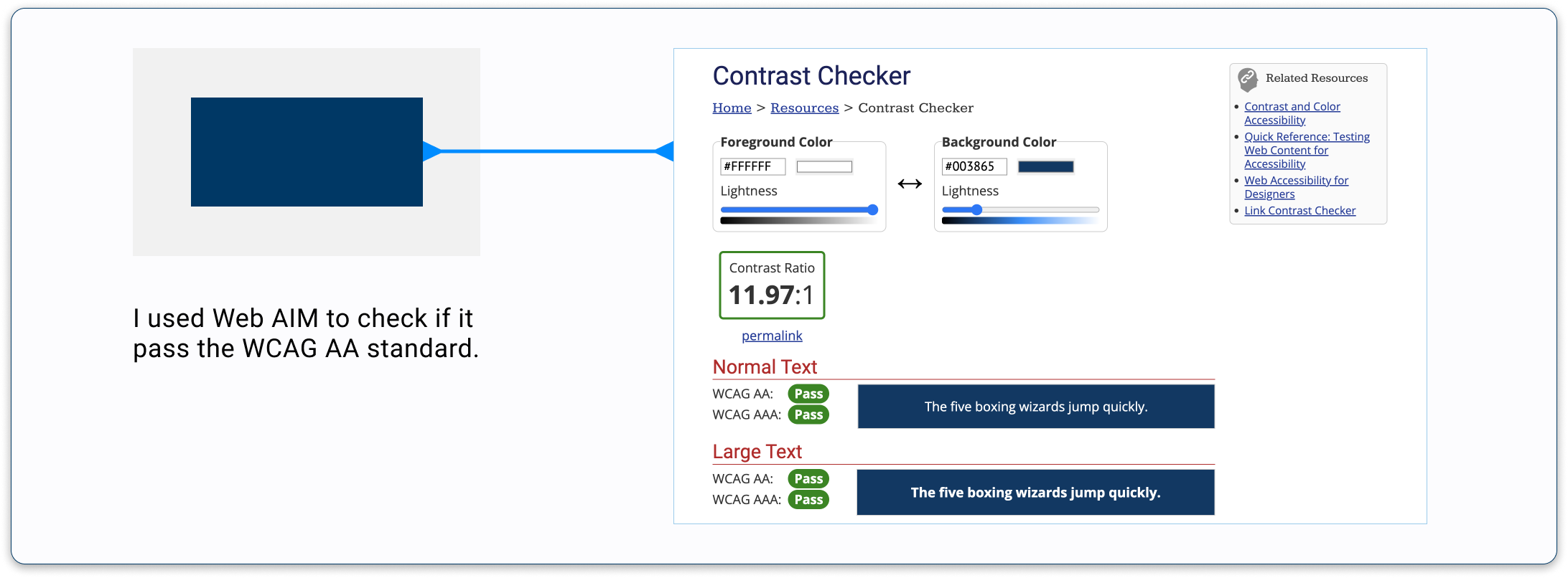
After careful consideration, I decided to still use the typical Columbia blue to be the main color of the app, which can intuitively express the characteristics of ReopenCU, at the same time, I added bright blue to highlight the focus of each page, focusing on the user's attention. 🧑🎨

Accessibility
When I designed the system, we also considered accessibility and confirmed all colors passed WCAG 2.0 AA standards.
Design Screenshot For This Version
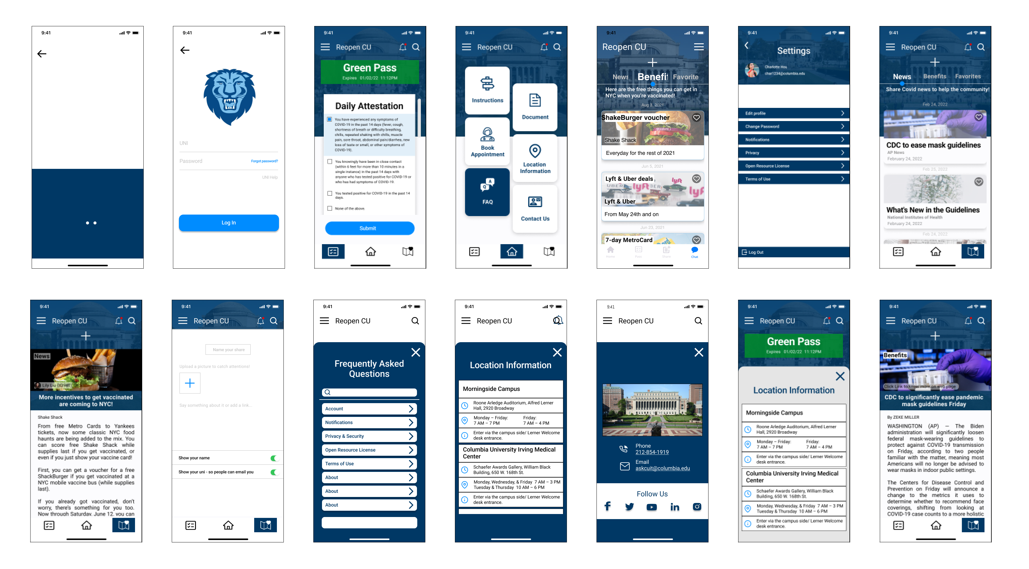
Test
Usability Testing
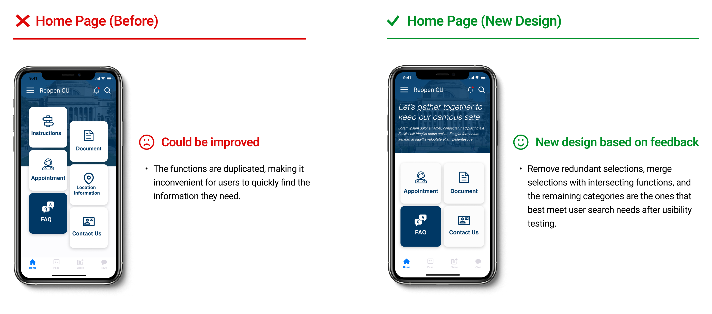
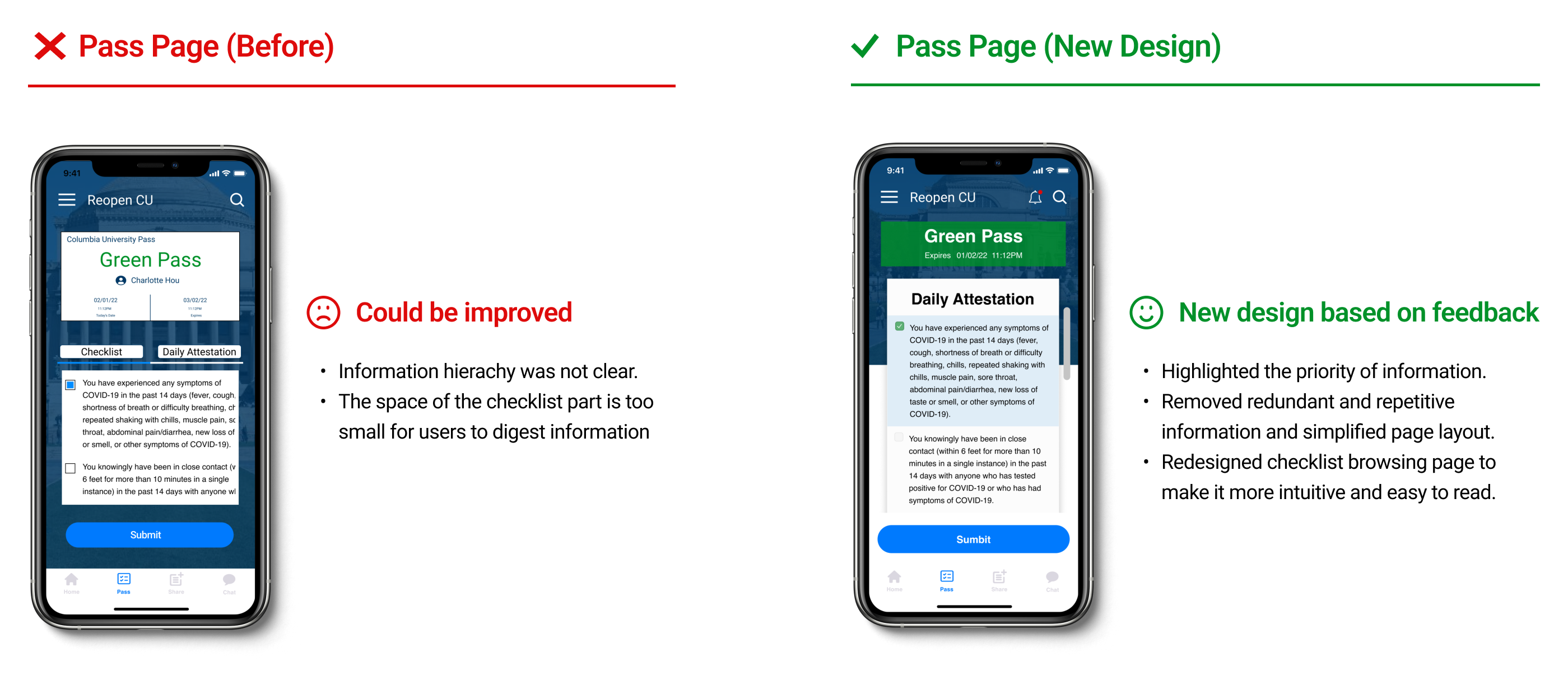
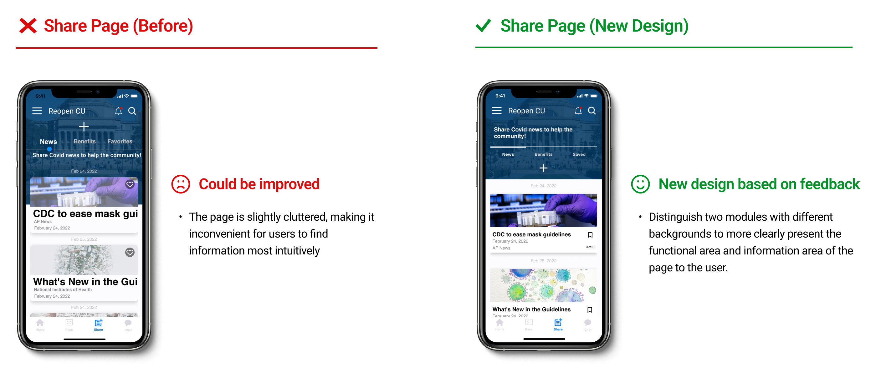
I started my testing with a small group of people and I found some usability issues. I found these issues and corrected them. After making these corrections, I tested in a larger group of 12 people. Below is an iteration of some pages I made.
Design Iterations
According to the feedback from the Usability Testing we did, I gained helpful feedback and then iterated design based on it. Here are some important design improvements.
Learn
Crucial Insights
Problems
- The page layout is cluttered and the same page is repeated in different sections.
- Missing feature to prompt important information.
- The confusing process to follow up, especially for first-time users.
- The information search system is daunting and exhausting.
- Limited functionality makes the app too monotonous.
Challenges
- Arrange duplicate checklist content on the same page and still be legible.
- Find an intuitive location to place the notification.
- Clearly represent the function of each area.
- Present the most frequently needed information in the easiest way to search.
- Increase app functionality and interactivity, but it must be useful and lively.
Research Impact
- Understood user pain points and provided clearer directions of solutions for future designs.
- Qualitative research found problems more specifically and avoids new problems that may arise for the redesign process.
- Quantitative research collected a wider range of data to avoid bias in interviewee selection, provided a wider reference template for the redesign process.
- Provided a clearer information hierarchy for redesign through the results of analysis and research.
My Learnings
- Quantitative research is often unavoidable, so as to avoid bias in interviewees or data selection.
- Analysis of existing products is also part of UXR, and your experience as a user also represents a large part of the user group.
- The question of formulating the survey is very critical. It is necessary to understand and analyze the situation of the market and the company before asking questions.
- The questions of surveys and interviews are not the same as the questions that research needs to solve.
- Interview questions should not be leading, preferably open questions.